
What is the Cumulative Flow Diagram: How to Master It
Learn from industry experts about all things Agile and explore how market-leading companies achieve more with agility.
What if a simple tool could help your team fix delays, stabilize progress, and bring better clarity around priorities? If you answered ‘yes, please,’ then we have great news for you: a cumulative flow diagram (CFD) is right up your alley.
What is a cumulative flow diagram, and how can it help your team align on workflows and clarify priorities? We’ll explain how a CFD benefits organizations by turning your value stream into a visual map that reflects how work progresses over time. Plus, you’ll learn how to master creating one in seven simple steps.
What is a Cumulative Flow Diagram?
For starters, a cumulative flow diagram is a stacked area chart that displays how many tasks sit in each workflow state over time.
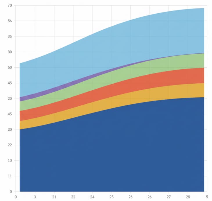
First, the horizontal axis represents time. Meanwhile, the vertical axis represents the cumulative number of work items. Each differently colored band marks a specific stage of your workflow, such as Backlog, In Progress, Review, or Done.
Because the chart builds cumulatively, every point contains the entire history of the system. The cumulative flow diagram shows work in progress, throughput, changes in arrival rate, and how long tasks stay in one stage.
Unlike sprint reports that summarize the past week, the flow diagram reveals long-term health and how your workflow behaves as conditions shift. Stable flow appears as parallel bands with minimal fluctuation, while widening or flattening bands show precisely where work is accumulating.
Is this confusing? Don’t worry, we’re about to break it down for you with a fun analogy.
The Highway Analogy: Cumulative Flow Diagram Explained
Think of it this way:
Imagine you’re looking down at a cross-section of a highway. The top line of the diagram represents cars entering the highway (the “To Do” list), and the bottom line represents cars exiting at their destination (the “Done” list). The colored bands in the middle represent the different stretches of the road, such as the on-ramp, the main lanes, and the toll booths. In a perfect world, the cars enter and exit at the same rate, and the road stays clear. However, the CFD shows you exactly where things go wrong:
- Traffic Jam (The Bottleneck): If the band representing the toll booth widens, it means cars are entering that section faster than they can leave it. You have a traffic jam (which we refer to as a business bottleneck) that is slowing down the entire journey.
- The Distance Between Lines (Work in Progress): The vertical height of the bands tells you how many cars are currently on the road. If the highway is too crowded (too much Work in Progress), any minor accident will cause a massive delay for everyone.
- The Travel Time (Cycle Time): This refers to the horizontal distance from the moment a car enters the highway until it exits, and tells you exactly how long the average trip takes. If that horizontal gap is growing, your commute is getting longer.
By looking at the ‘shape’ of the traffic, the CFD tells the highway engineers (aka, your agile team) exactly where they need to add a lane or clear a wreck to keep things moving smoothly.
Why a CFD Matters for Agile Leaders
For senior leaders, the patterns in their cumulative flow diagram can significantly influence decisions on staffing, prioritization, and strategy. For example, if the cumulative flow diagram exposes a widening band in a specific stage, it becomes clear that you need to address capacity limits or handoffs.
On the upside, when throughput trends upward, leaders gain confidence that teams can take on new commitments. This level of insight creates alignment across the organization and supports a more resilient approach to continuous evolution.
The best part? Leaders who understand flow can turn volatility into opportunities while protecting teams from burnout and overload. Now that you know the value of the cumulative flow diagram, let’s discuss the key metrics it tracks.
4 Metrics Your CFD Should Track
It all boils down to this: the purpose of the cumulative flow diagram is to clear bottlenecks and keep tasks flowing smoothly. So, how can you successfully track this? In general, agile teams follow these metrics:
1. Work in Progress
The vertical distance between bands shows how many tasks are in progress. High WIP signals that too much work has been started without finishing earlier items. Maintaining healthy WIP supports a stable process and keeps cycle time predictable.
2. Throughput
The slope of the Done band shows how many items are completed per unit time. Rising throughput usually indicates improving team performance and better flow efficiency across stages.
3. Cycle Time
Cycle time appears as the horizontal distance between when an item enters In Progress and when it reaches Done. Teams can calculate the approximate average cycle time by measuring this spacing over several weeks.
4. Arrival Rate vs Completion Rate
If the cumulative number of incoming items increases faster than throughput, the diagram will show widening bands. This imbalance often leads to long tasks becoming stuck at specific stages.
These signals help leaders make informed decisions about staffing, intake policies, and sequencing. Instead of interpreting dozens of KPIs, the cumulative flow diagram brings clarity to the entire system!
How to Read the Shape of Your CFD
It’s one thing to track your metrics; it’s another, actually, to interpret what the data is showing you. For beginners, it all comes down to the shapes of your cumulative flow diagram’s lines and bands. Here’s a breakdown:
Parallel, Evenly Spaced Bands
This pattern shows a stable process. Throughput and arrival rate are balanced, and tasks move smoothly across workflow states.
A Bulging Band in a Specific Stage
This indicates a bottleneck. Not good! When one stage expands faster than others, capacity limits or unclear policies may be slowing progress. Here’s the good news: the bottleneck is on your radar now! Identifying bottlenecks early will help you prevent project progress from stalling.
A Flattening Done Line
If the Done band stops rising, throughput is dropping. So, what does that mean?
This may happen when teams multitask across too many priorities or when upstream delays slow the entire system. To alleviate this problem, you can implement a strict Work-in-Progress (WIP) limit. By capping the number of tasks allowed in the In Progress and Review stages, you force the team to resolve current blockers or finish pending reviews before they can pull in new work from the backlog.
A Sudden Increase in Total Items
A spike in the vertical axis signals large batch intake, which increases lead time. Spikes occur when a massive project or a giant epic is moved into the system all at once. Why is this a problem? It’s simple: uncertainty across your team will rise until those items flow through the process.
To fix this, require all tasks to be broken down into smaller, equal-sized projects before they leave the backlog. Smaller items move through the In Progress and Review bands more quickly, helping your team feel more confident about completion.
Converging Bands
When bands move closer together, the team is catching up, leading to improvements in WIP limits, better workflow states, or reduced context switching. It’s a good sign!
7 Steps to Master the Cumulative Flow Diagram
It’s official: You know how to read your cumulative flow diagram! Congratulations. Ready to take it up a notch? Now let’s learn how to use your CFD to guide your decisions and build more substantial alignment across your teams.
Step 1: Define a Clear Value Stream
You wouldn’t try to measure a cross-country road trip by only looking at the time you spent in the driveway, would you? The same is true for your business!

To get a cumulative flow diagram that actually tells the truth, you need to start with a single, unified value stream, such as ‘Concept to Release’ or ‘Request to Resolution.’ Do this:
- Define clear, real-world start and finish points that reflect how value actually moves.
- Mark the first stage as the moment work is officially committed, not just an idea floating in the backlog.
- Represent the last stage as the point where the work is fully delivered and in the customer’s hands.
When you anchor your diagram to these goal posts, your CFD will show you exactly how long a customer waits for a result, rather than just how long a task sat in a specific tool-specific status.
Step 2: Simplify and Clarify Workflow States
A cumulative flow diagram becomes difficult to interpret when teams use too many workflow states. Next thing you know, your ‘chaotic’ CFD is working against you, not with you! Obviously, you don’t want this to happen.
To avoid this, choose a set of stages that matter for decision making and write clear entry and exit criteria. When items flow smoothly from one stage to the next, the cumulative number of items will accurately reflect progress across the entire system.
Step 3: Set Realistic WIP Limits
Consider this: work in progress shapes the cumulative flow diagram more than any other factor. How?
Think of WIP as the ‘volume’ of your system. It directly controls the vertical distance between your lines:
- If WIP remains too high despite limits, the diagram will expose the problem through widening bands.
- If WIP shrinks, you’ll see a more stable process and a more predictable cycle time.
That said, you should partner with your agile teams to set practical WIP limits based on staffing and demand.
Step 4: Capture a Baseline for Throughput and Cycle Time
Now, let’s talk about the two heavy hitters of flow: throughput and cycle time.
You wouldn’t try to tune a high-performance race car while it’s still sitting in the garage, would you? And you certainly wouldn’t start swapping out engine parts without first knowing your 0–60 mph time! The same goes for your CFD. You have to define your baseline.
Before you go making big moves or rearranging your team’s entire workflow, you need to collect several weeks of flow data. This is your baseline, your bench press max. This baseline helps you unmask the reality of your system:
- The Pulse (Throughput): How many tasks are actually crossing the finish line each week?
- The Commute (Cycle Time): How long is the average trip from Start to Done?
- The Speed Bumps (Long Tasks): Which specific tasks are acting like a flat tire, dragging your averages down (aka BOTTLENECKS!)?
- The Wobble (Variation): Is your flow a smooth, predictable stream, or a chaotic series of stops and starts?
By establishing this baseline first, you turn “I think we’re faster” into “We just reduced our wait time by 22 percent.” It gives you the power to quantify your wins whenever you experiment with new practices or adjust your team’s capacity.
Pretty clever. But, we’re not finished yet! Keep reading to learn more essential steps.
Step 5: Review the Cumulative Flow Diagram on a Cadence
Leaders should include a short CFD review in regular governance or portfolio meetings. The goal is not to analyze every detail but to focus on trends. Ask questions such as:
- Which bands widened in the past week?
- Which workflow states improved?
- Where does the chart show capacity constraints?
- Should we change staffing or limit new intake?
At the end of the day, teams build stronger decision-making habits when they consistently review the cumulative flow diagram over a time frame that aligns with their planning cycles.
Step 6: Forecast with Probability Instead of Exact Dates
Once throughput stabilizes, the cumulative flow diagram can be used to forecast delivery ranges. You can use historical patterns to determine how long similar items have taken.
This approach helps agile leaders steer commitments without placing unnecessary pressure on teams. It also strengthens trust by reducing the risk of missed delivery dates.
Step 7: Integrate CFD Insights into OKRs & Innovation
Your CFD becomes most powerful when you use its insights to influence organizational goals and your business’s Objectives and Key Results (OKRs). You can even use your CFD insights as a ‘flight radar’ as your team navigates high-velocity uncertainty, such as new market disruptions and disruptive innovation.
For example, spotting the ‘Innovation Clog’: disruptive products require extensive testing and feedback.
Therefore, you can use your CFD to spot ‘innovation clog’ during this process. If your Review or Customer Feedback band is getting thicker than a triple-decker sandwich, your disruptive innovation is likely stuck in a bottleneck. Once you see the clog in your project progress, your team can take action!
Level Up Your Business
As you can see, a cumulative flow diagram is a powerful tool that helps agile leaders transform their businesses and teams into high-performing, confident, and aligned value-delivery engines.
When you successfully master your CFD, you move one step closer toward a data-driven culture where bottlenecks are cleared before they become crises. It’s a great way to level up your business and accelerate your agile transformation.
Need a little extra help with your business transformation? At Hyperdrive, we have expert agile and Scrum trainers who can help you define and master your cumulative flow diagram. From product innovation to business transformation, our coaches are ready to help you take your business to the top! Meet our trainers today.
Frequently Asked Questions
How often should we update our cumulative flow data?
Daily updates are ideal. Review the chart weekly for team-level decisions and monthly or quarterly for executive reviews.
What common mistakes distort a cumulative flow diagram?
Frequent changes to workflow states, inconsistent board usage, and the omission of side-channel work make the diagram unreliable.
Can CFDs be used outside software development?
Yes. Any repeatable workflow with multiple stages benefits from a flow diagram, including content production, marketing, operations, and procurement.
How should we visualize work that spans multiple teams?
Create a shared end-to-end diagram that reflects common workflow states while allowing teams to maintain local boards.
Questions? We Can Help.
When you’re ready to move beyond piecemeal resources and take your Agile skills or transformation efforts to the next level, get personalized support from the world’s leaders in agility.